Colin Greenland’s Harms Way cover at left is nothing too terrible – it fulfills what a sci-fi cover is supposed to deliver: an illustration of what’s going on between the covers with a composition that creates a fair amount of interest to lure readers in. That same book (at right) can also look like a cheap Harlequin romance and serve as a gross and shameful misrepresentation of the novel….. those are the type we’re going to look at today. Enjoy.
I can only assume what’s in that syringe straightens a bad home-perm.
I think a bearded man with lady-breasts with the body of a lion being dry-humped by a slug-unicorn giving birth to eggs bearing demon monkeys qualifies as “strange relations”, don’t you?
One of Hitler’s scientists cryogenically freezes himself, thawing out in the 21st century. What follows is as ridiculously lame as the cover would indicate.
What kind of godawful alien is that lurking in the back? Is it a floating bread roll with fangs? This is not good. Not good at all.
I’m sure albino tiger-woman is not lifting this unicorn upon her back, but it’s still a dazzling piece of poor composition.
Heinlein’s Number of the Beast had nothing to do with stormtroopers , of course; but that didn’t stop this cover from riding the Star Wars gravy train.
Sorry, Kansas. The gods hate you.
The covers on the Laser Books all had the same format: a big head in the foreground and something weird going on in the background. It’s like they discovered photobombing way before the Internet.
I should also mention that is by Kelly Freas, the man who created the look for Alfred E. Neuman in MAD. He was also a sci-fi cover master – suffice it to say, this isn’t one of his better works.
This ‘cosmic custodian’ should probably ease up on the eye shadow just a little if he wants to be taken seriously by the Prophets of Evil.
You know you’re a badass when you literally use young women as your loincloths. It can be a bit cumbersome, but it’s worth it.
I haven’t the slightest idea what’s going on here, and not the slightest desire to find out.
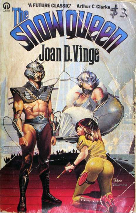
What’s with the obsession with the female backside in sci-fi/fantasy artwork? I understand it’s a grand tradition starting with Frazettat then Valejo… but it could get a tad ridiculous (as with the cover above).
…like I said – ‘a tad ridiculous’.
The leaping tiger with the face of a bearded Sean Connery transcends the ability of human speech to convey its awfulness. Truly a low watermark in the history of sci-fi covers and a fitting end to this list.
Would you like to support Flashbak?
Please consider making a donation to our site. We don't want to rely on ads to bring you the best of visual culture. You can also support us by signing up to our Mailing List. And you can also follow us on Facebook, Instagram and Twitter. For great art and culture delivered to your door, visit our shop.


