The late 1960s and 70s were all about experimentation and breaking with tradition – and the realm of interior decoration was no exception. The previous decades had been fairly conservative, but by 1965 loud colors and unconventional furniture started to make an appearance. Here’s a look at some particularly creative and mind-blowing creations from this time period.
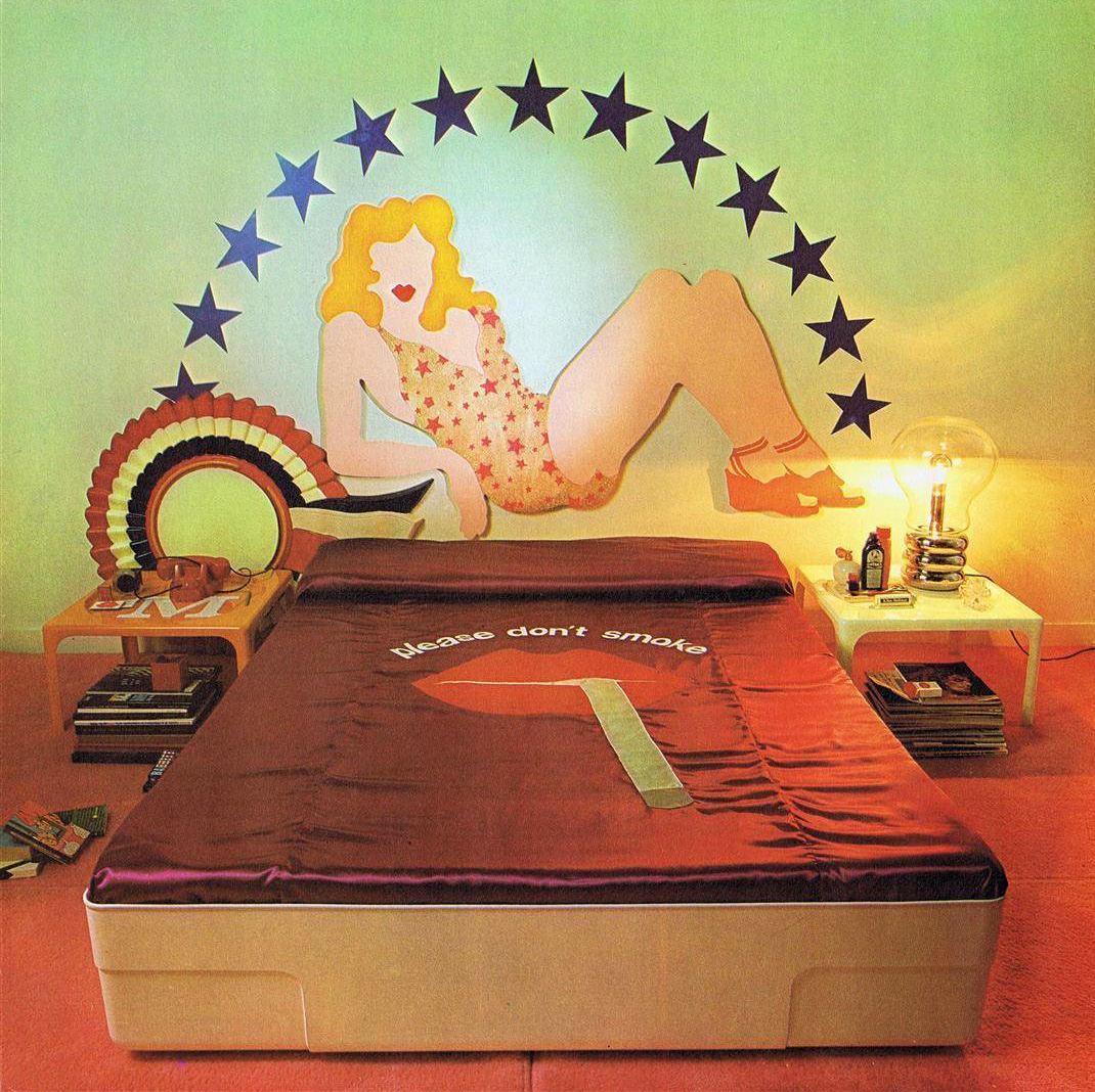
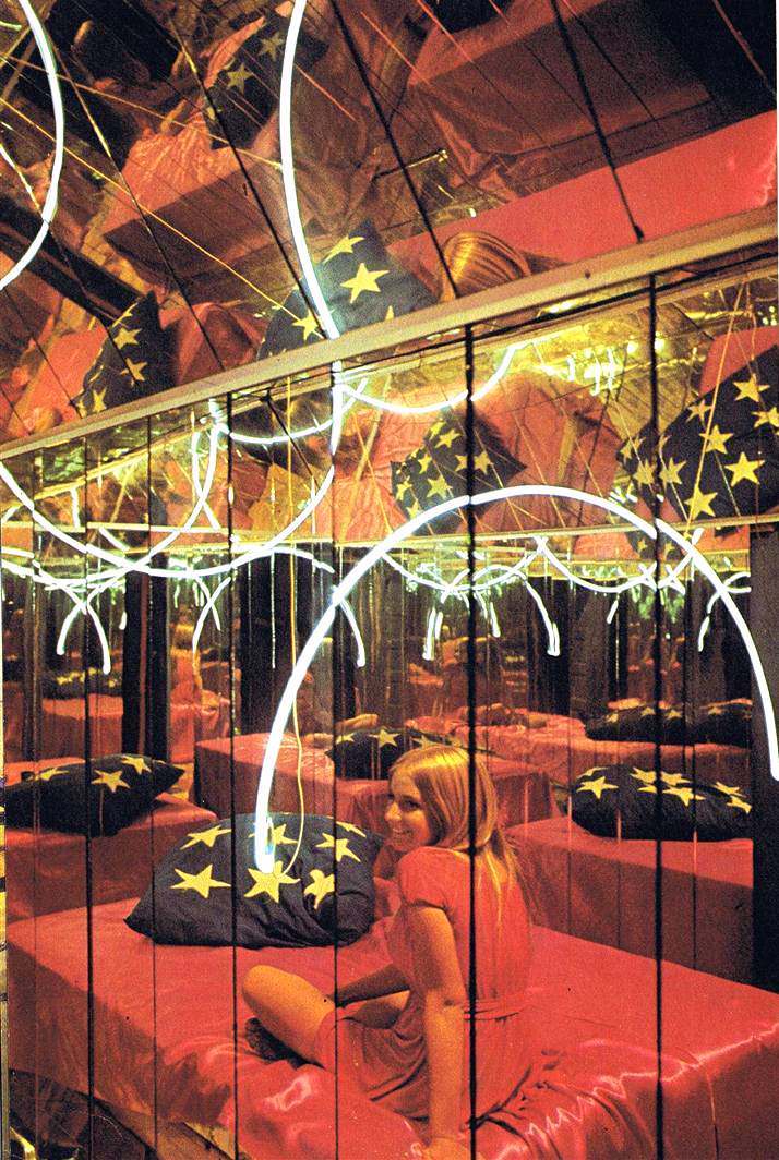
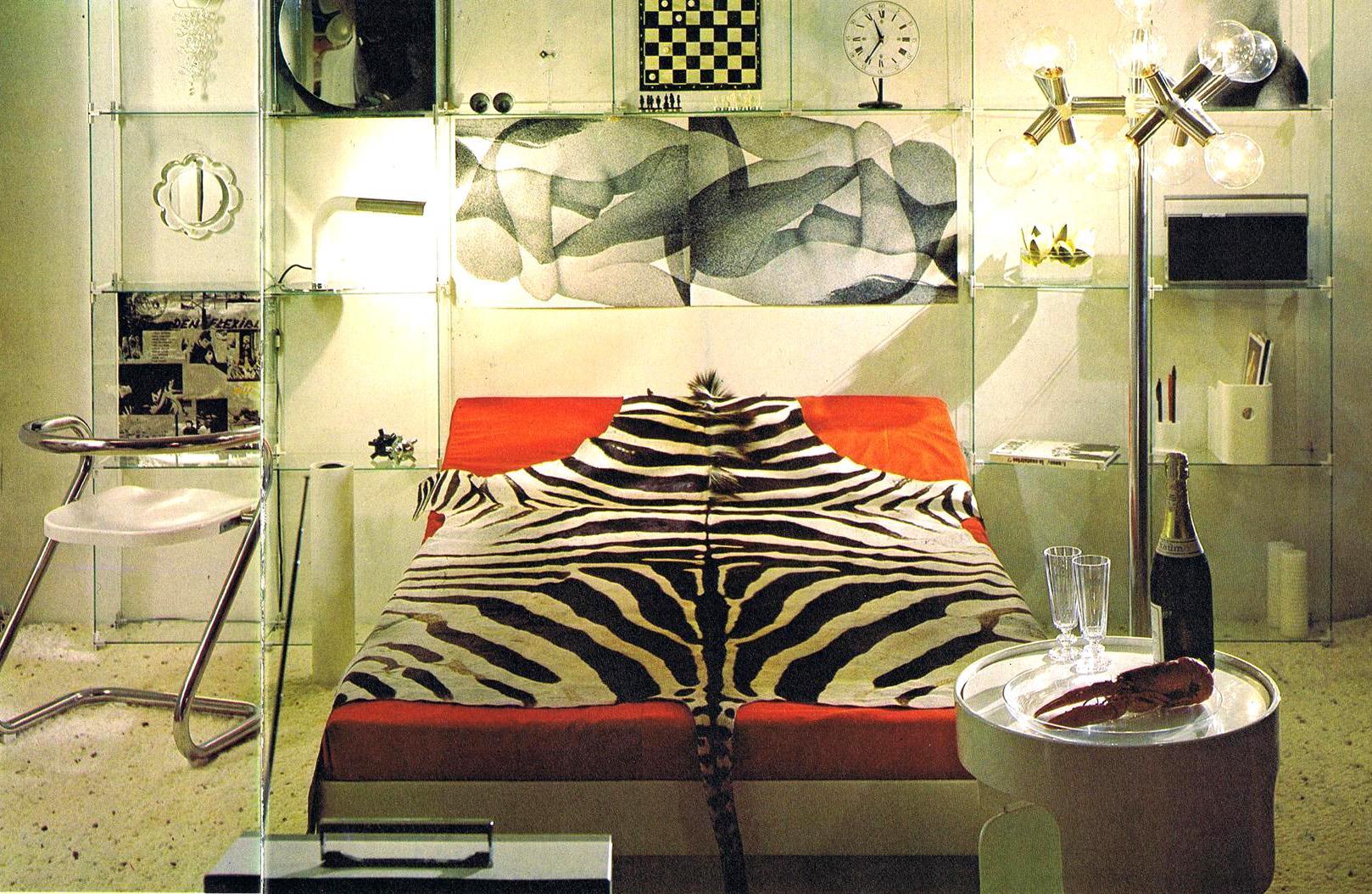
Back before waterbeds were considered tacky. I actually had one, and to this day it is the best bed I’ve ever owned. The 1970s variety didn’t have the internal matrix of padding to stabilize – it was just a big bag of water. Swingin’ studs of the 1970s didn’t seem to mind.
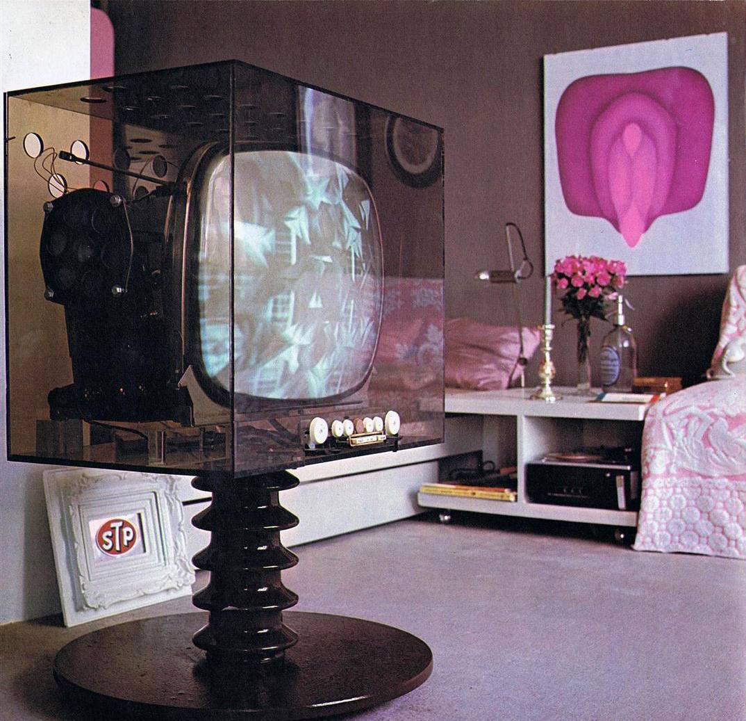
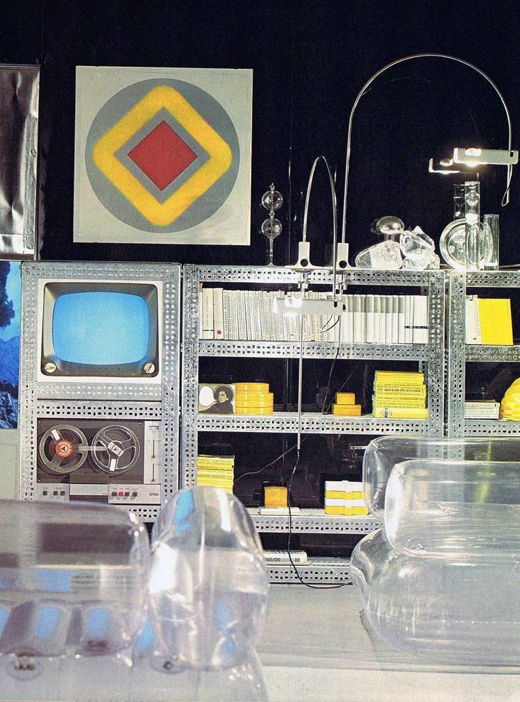
I presume this TV was functional and didn’t just display psychedelic patterns to trip with. Then again, that would have been a worthy function in the 1960s.
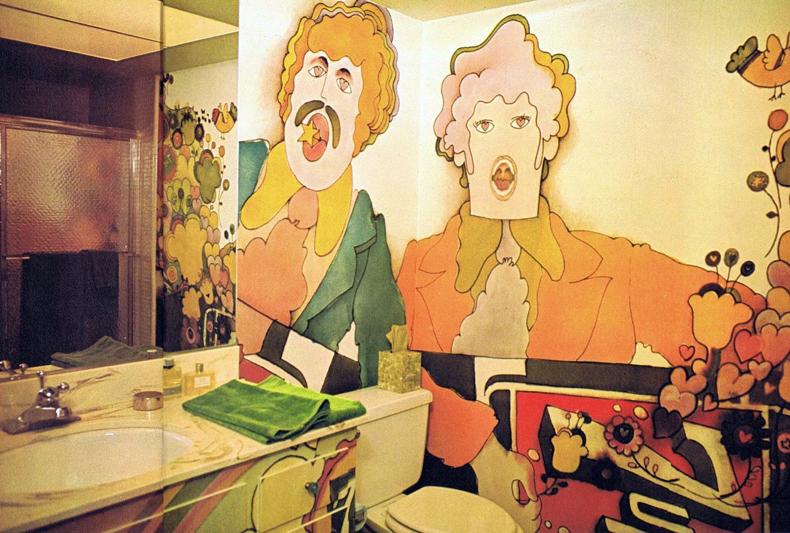
Call me old-fashioned, but I’d find it extremely difficult to use the bathroom amid an explosion of psychedelic cartoons.
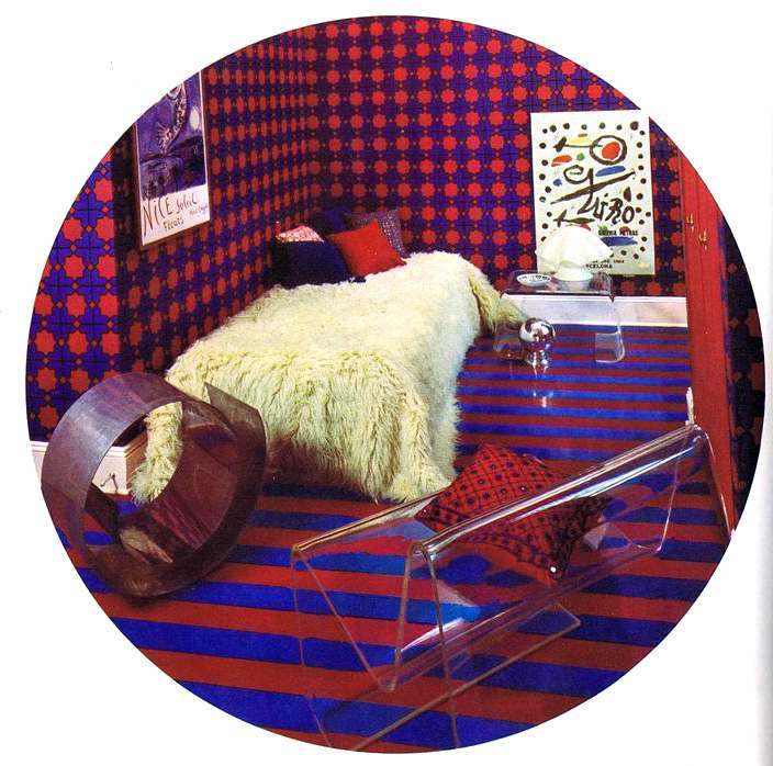
It apparently wasn’t enough to take a psychedelic trip on recreational occasions; true hipsters had to have mind-bending surroundings 24-7. This bedroom is the opposite of “cozy”.
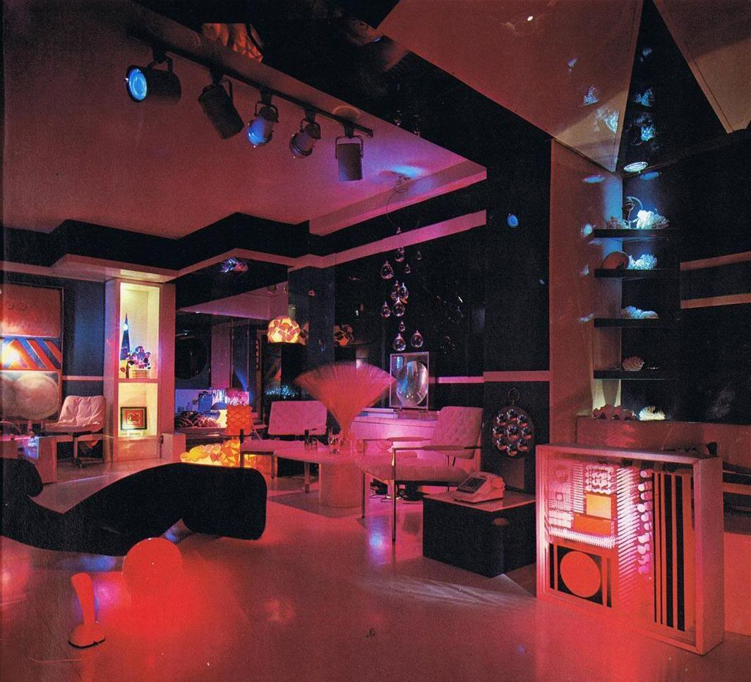
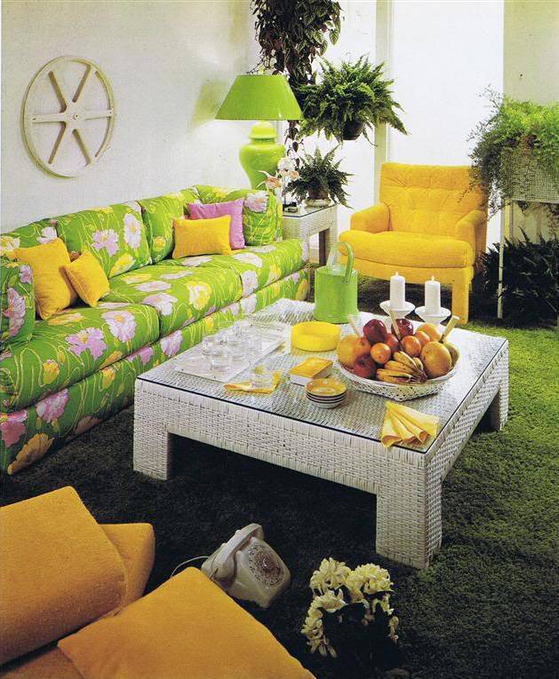
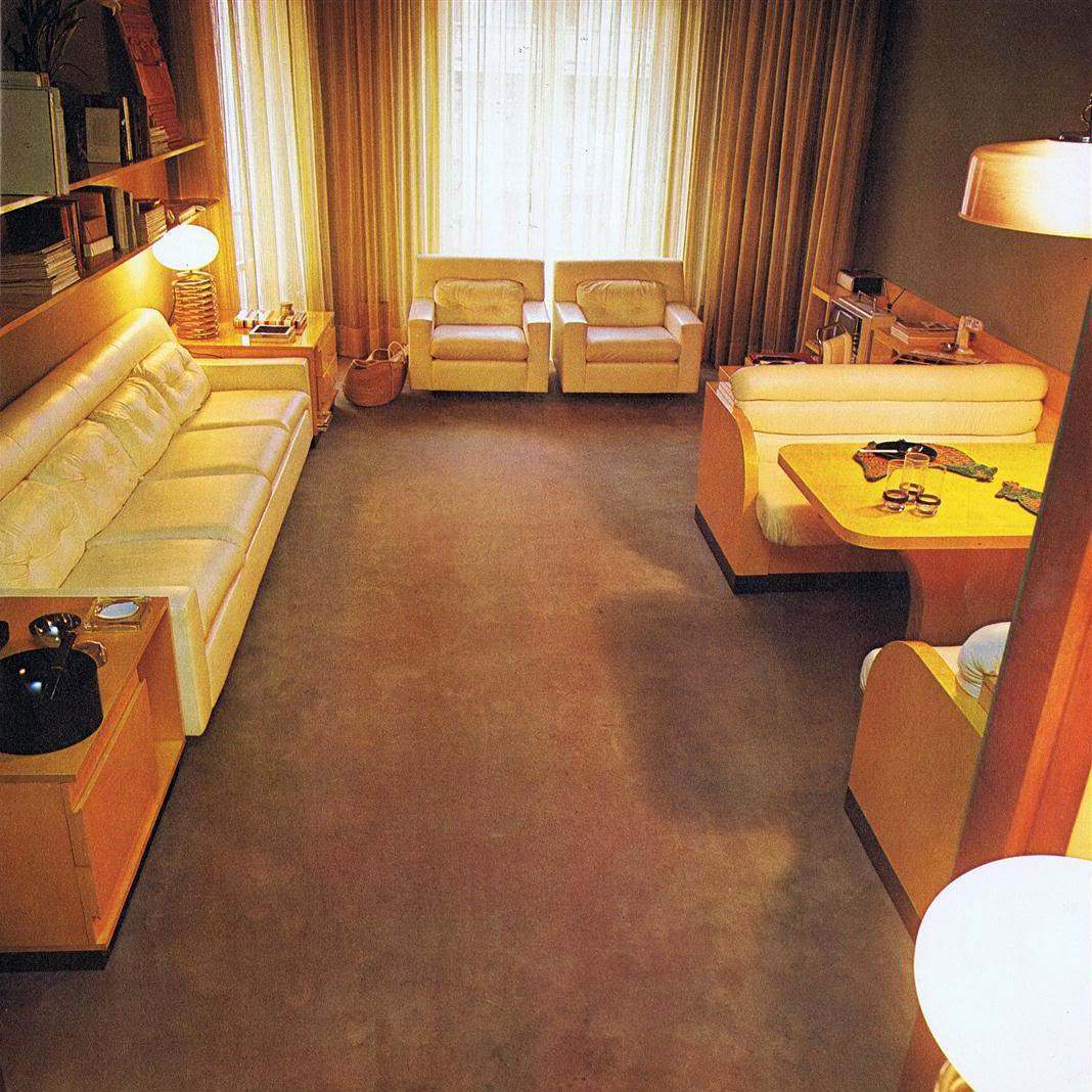
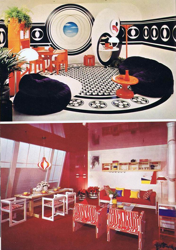
A bit more conservative – I wouldn’t mind living here. Yes, it’s like the Easter Bunny exploded in your living room, but at least sofa isn’t made of transparent plastic and there are no Peter Max cartoons lurking around.
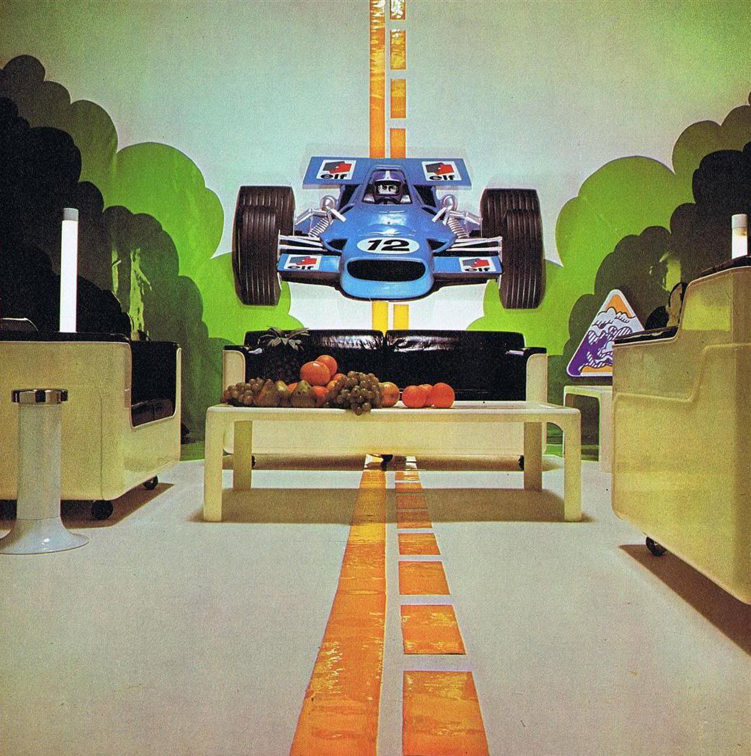
Again, you can call me old-fashioned, but I’d find it a tad difficult to have a conversation in this living room. I can’t imagine it would be fun for fellow acid-trippers either – that car is definitely going to emerge from that wall at some point.
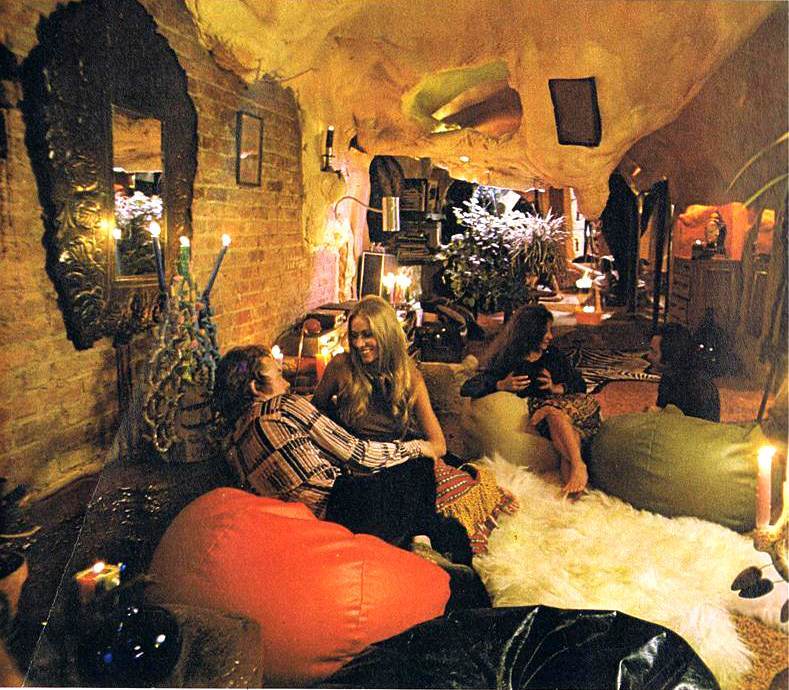
Now we’re talkin’. Somehow, when you add a groovy party to these psychedelic interiors, they don’t seem so bad. When you get a look at these rooms in use, the stark surrealism becomes understandable – these weren’t meant for quiet alone-time with your TV or PS4 . These were meant for getting down.
Probably not the best place to do homework or curl up with a book. But then, I don’t think that’s the intention.
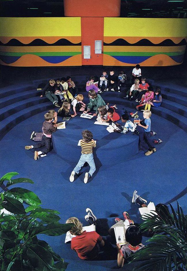
This is St. Paul’s School in St. Paul, Minnesota. I include it demonstrate just how far-reaching these trippy bold designs were. I’ll wager the teacher’s meetings held here after school hours smelled distinctly of the herb.
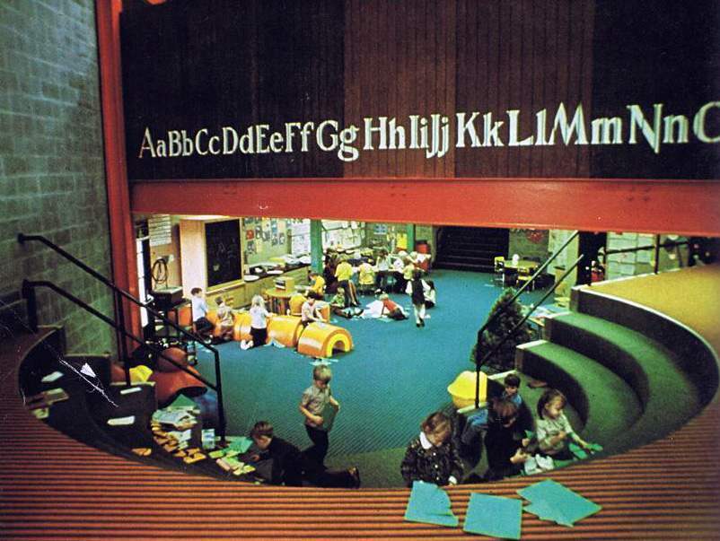
Here’s another school…
Mount Healthy School, Columbus, Indiana
I actually dig this room. It doesn’t cross the line into over-the-top; and I think it might even work in a home of 2015. Unlike the next entry…
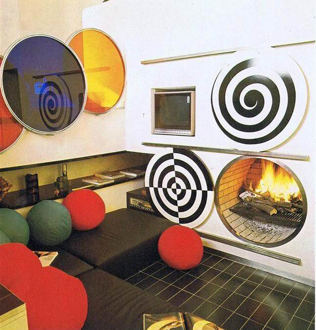
The caption for this design reads:
“The circle provides a basic motif for this room… in the form of wall disks, bull’s eyes, and spherical cushions. Here we have a room designed for both art and comfort. Foam cushions in brown covers are arranged into a sort of daybed, below a ledge for books. The television set is recessed into the wall, and spherical motifs echo the shape of the circular fireplace. White walls and the netural brown of the tile floor emphasize primary colors scattered throughout the room. Everything works together here because a variety in color is balanced by a classic repetition in shapes.”
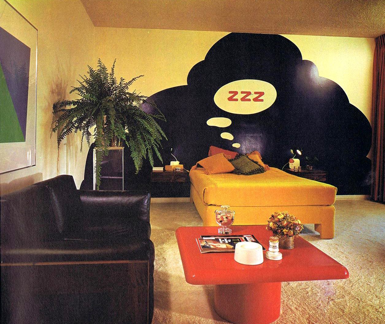
A bedroom worthy of Ron Burgundy. Stay classy.
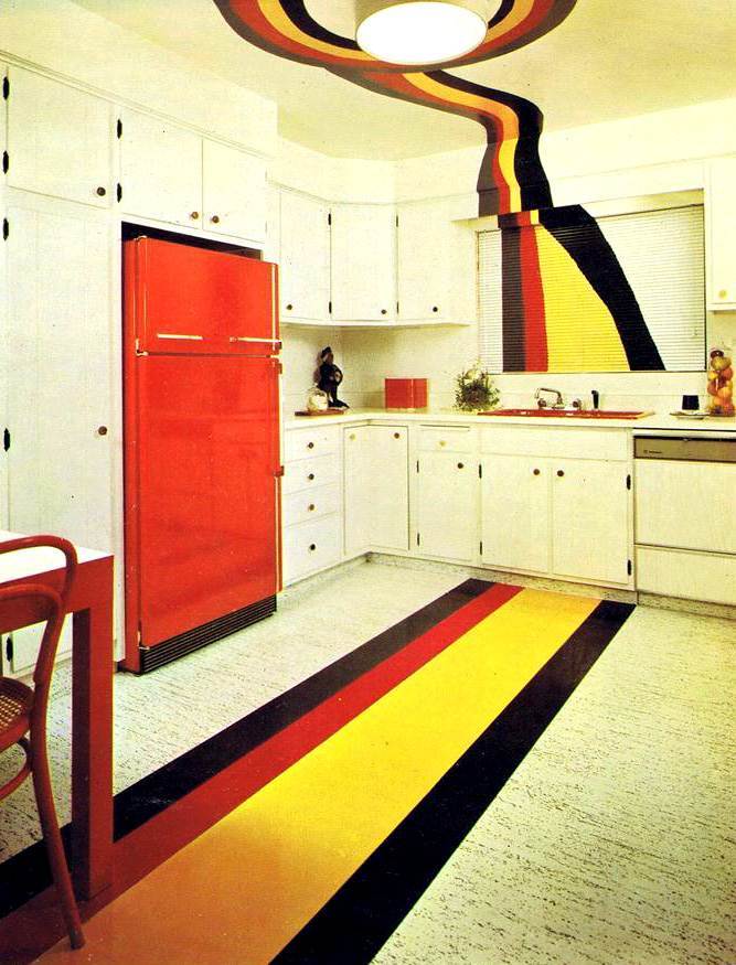
You may recall the Kotter’s living room/kitchen area (on Welcome Back, Kotter) had a similar stripe pattern (with lettering, if I remember right). That apparently was a “thing” back then.
It’s easy to mock these designs, but you’ve got to give them credit for pushing the envelope. It’s easy to be conservative – there’s nothing to really point the finger at and make fun. When you push the limits, you open yourself up for ridicule, especially decades later when tastes have changed. So, as gaudy and insane as these may first appear, I have to give them respect for not being boring.
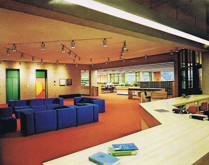
Monroe C. Gutman Library, Harvard University. A really nice blend of the “new” with the conservative. A notice to you youngsters: that structure in the background is something called a “card catalog”.
From the book: “The rooms here are a perfect example of industrial thinking at home. Inventiveness plus resourceful use of materials has transformed ordinary spaces into far-out visual trips.”
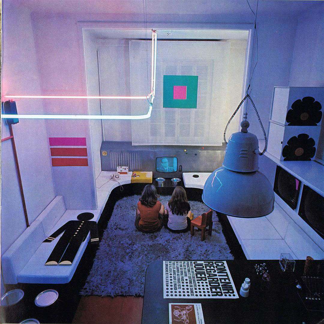
Those poor kids.
See also: Seeing Red In The 1970s: A Decade’s Fixation With The Colour Of Death, Fear And Regret
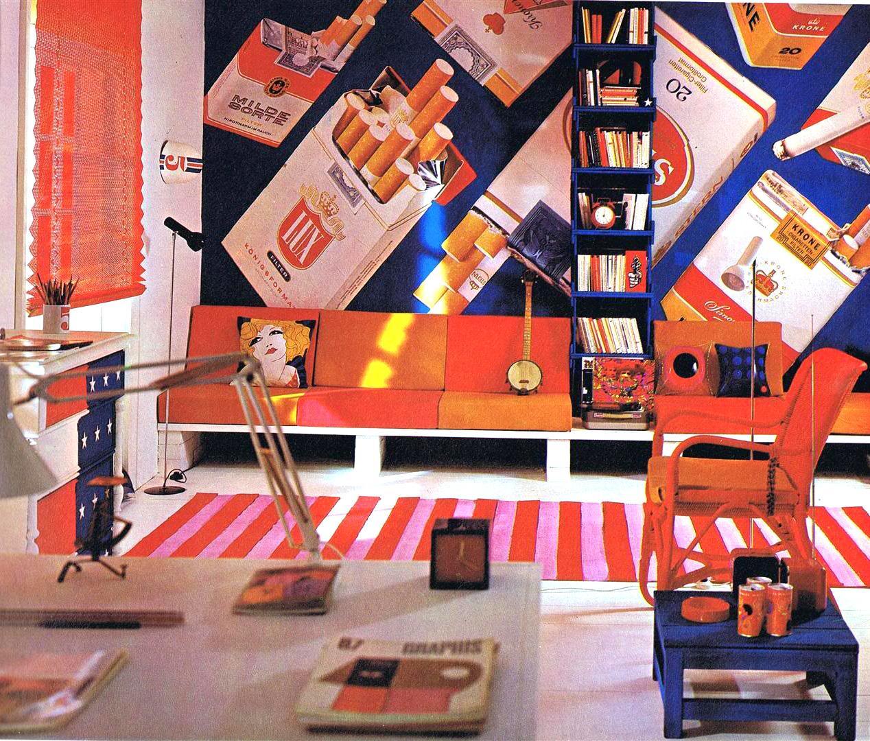
And we’ll end on my favorite. Smoke ’em if you got ’em.
A big thanks to Retro Hound for offering these fantastic scans.
Would you like to support Flashbak?
Please consider making a donation to our site. We don't want to rely on ads to bring you the best of visual culture. You can also support us by signing up to our Mailing List. And you can also follow us on Facebook, Instagram and Twitter. For great art and culture delivered to your door, visit our shop.
