Today we present a hitherto unexplored adventure of Barney’s into magazine design; his contribution to 70s music title Let It Rock.
Let It Rock’s launch in 1972 coincided with “the first era of post-modernism in pop,” as the late great Ian MacDonald told me in my music press history In Their Own Write. “Music started to be conscious of itself and look back and begin to make syntheses and style references and be ironic.”
Of course, the collective which founded the publication – Simon Frith, Charlie Gillett, Phil Hardy, Gary Herman, Ian Hoare and Dave Laing – were riding the zeitgeist; in fashion a stylistic revolution was being sparked by Malcolm McLaren and Vivienne Westwood’s investigations into 50s musical subcultures at their King’s Road shop of the very same name, while visual artists such as Barney were enthusiastically plundering the recent history of art and commercial design to reinvigorate the world of graphics.
In the mid 70s John Pidgeon took over as Let It Rock editor. “I got to know Barney after he designed the Sutherland Brothers first album and loved the fact that he had shot holes in it with an airgun,” says John. “I immediately discovered we had mutual friends in Ian McLagan and (another of Barney’s Twickenham college pals) Mick Finch.”
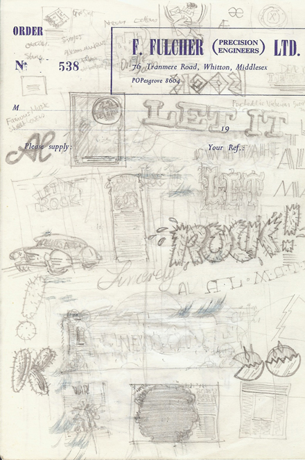
A couple of years later John set about revamping Let It Rock and invited Barney over to his flat in Clapham, south London, to discuss a redesign. “When he arrived, he unfolded reams of penciled artwork, all of which he had drawn on the tube between Isleworth (or whichever West London stop it was) and Clapham Common,” says John. The options were sketched on headed paper from Barney’s dad’s company.
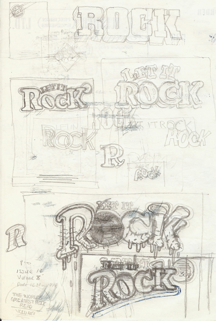
As these two sheets demonstrate, Barney focused on the font for the magazine logo, and also produced single page and double page spread layout samples (including one using a Bob Dylan feature for direction on photography and text placement).
Presenting a subheading “The world’s greatest rock read”, Barney notes the magazine sections Oldies, Singles, Album reviews, News and Letters, and provides the last with its own ident: a bobbysoxer writing fan-mail.
One masthead uses kitsch “cactii” lettering – as in Barney’s Chilli Willi And The Red Hot Peppers drumhead logo and another substitutes the “o” in “Rock” with a spinning reel of tape.
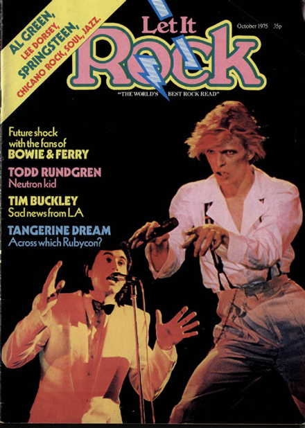
John – whose CV includes much journalism, many masterful music documentaries and a spell nurturing the comic talents of The Mighty Boosh and Ross Noble at the BBC – was knocked out with the selection and chose a font which Barney completed with the addition of a lightning bolt decoration.
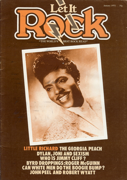
This was introduced onto the magazine’s front cover in the January 1975 issue. “For the catchline I amended ‘greatest’ to ‘best’,” says John. “Otherwise it was a typically brilliant Barney Bubbles slogan.”
Would you like to support Flashbak?
Please consider making a donation to our site. We don't want to rely on ads to bring you the best of visual culture. You can also support us by signing up to our Mailing List. And you can also follow us on Facebook, Instagram and Twitter. For great art and culture delivered to your door, visit our shop.


