
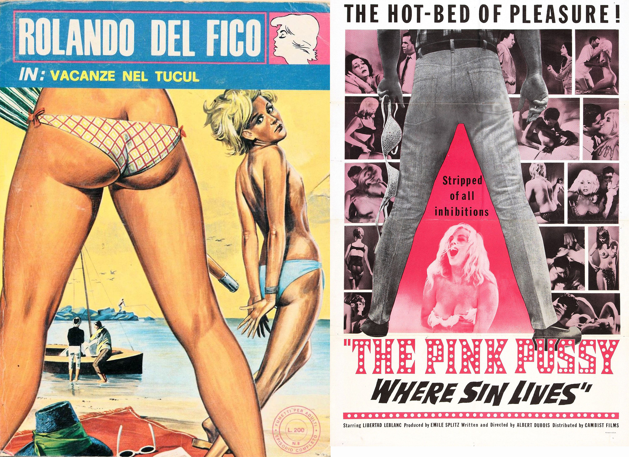
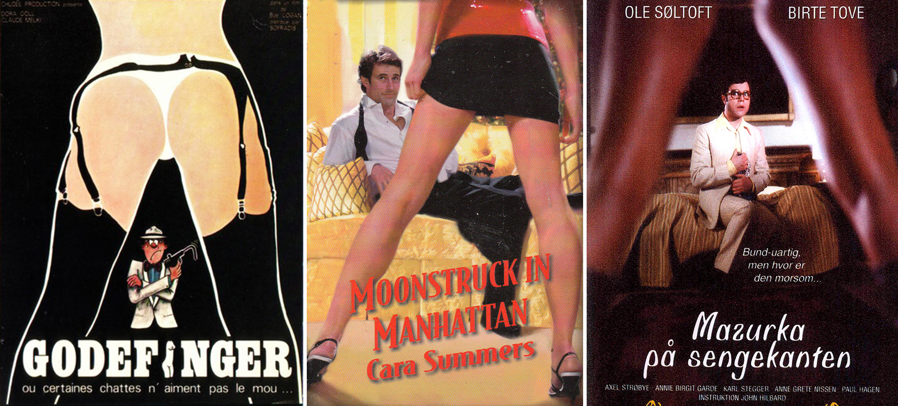
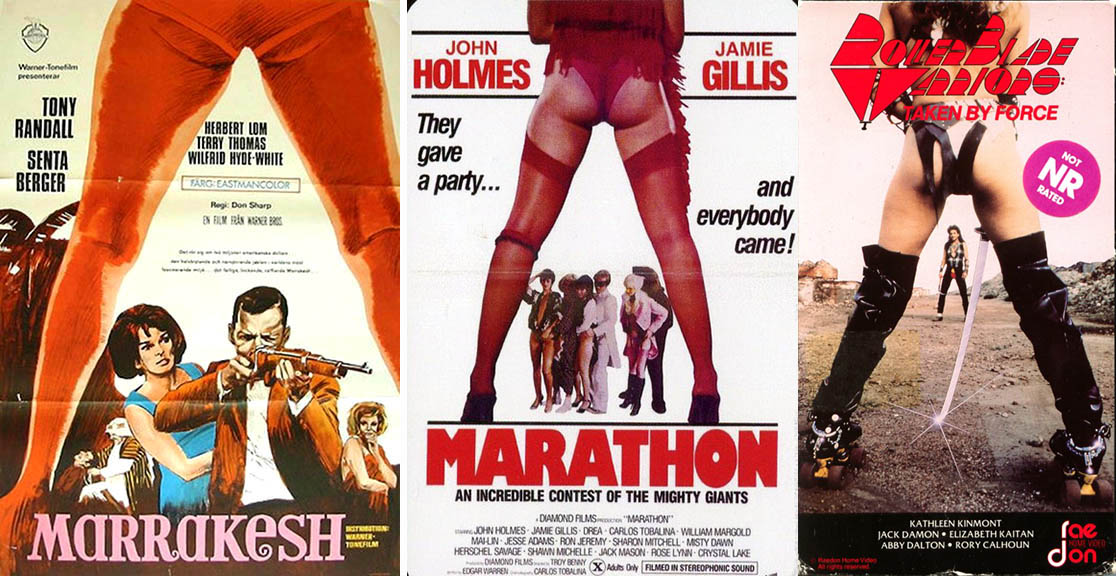
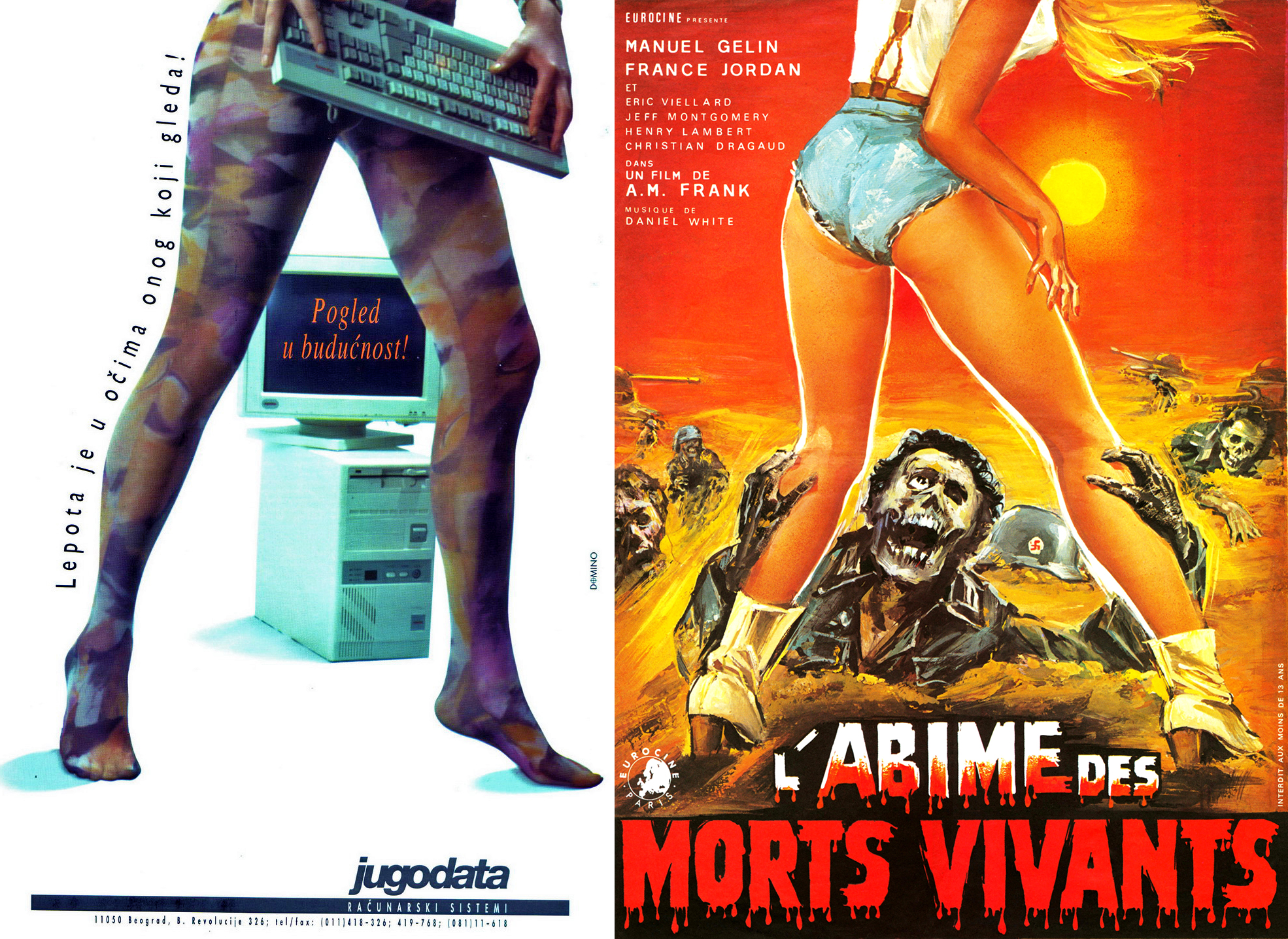
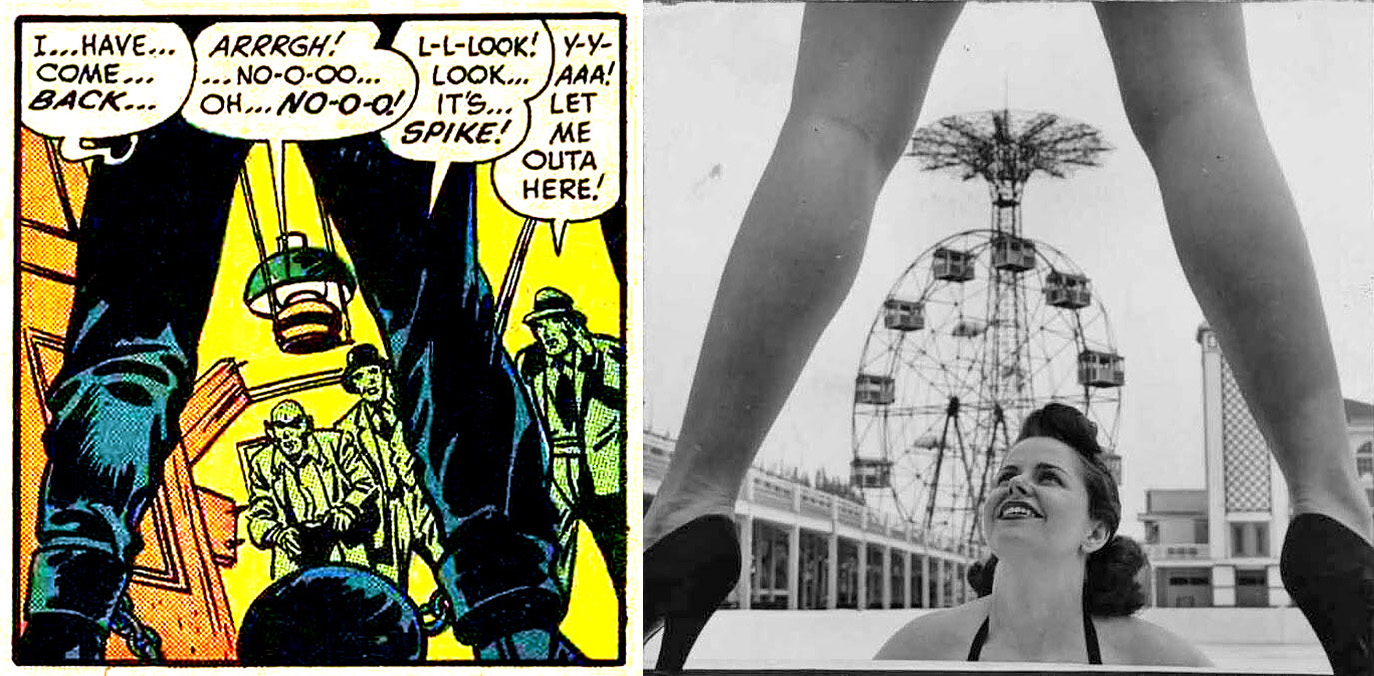
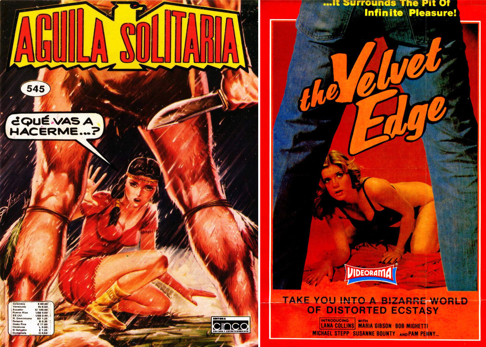
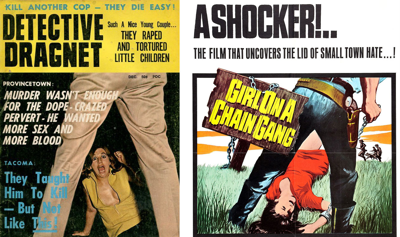
No concept has been used to compose pop culture art more liberally, with such wild abandon, as the amazing A-Frame. We all recognize the arrangement: a man or woman’s legs are spread apart, and it is through this gap that we see the subject. We covered this topic once before, but it was such an omnipresent sight days of yore, that it deserves more attention.
And more attention it shall receive: herein is a MOTHERLOAD of A-Frames. Let’s have a look and see if we can make sense of this design virus that swept the covers of magazines, books, movie posters, and other pop art creations throughout the 19650s-1980s (and continues to this day, in fact).

It’s easy to see that the A-Frame is a symbol of power and dominance; however, as we’ll also notice – it can have a sexual connotation as well.
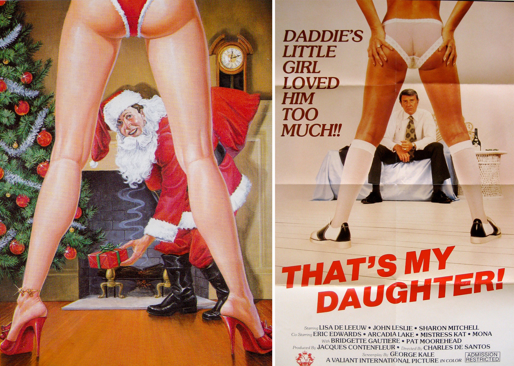

As we said in our initial article on the A-Frame: The individual appears larger and above the secondary figures, and you’ll notice time and again that when it’s a man in the A-Frame position, the power is from violence – i.e. a showdown between two cowboys, or a violent attacker. When it’s a woman in the A-Frame position, it’s sexual – long slender legs, almost always with heels. James Bond in the For Your Eyes Only movie poster may have the gun; however, there’s no denying the anonymous, faceless woman has all the power…. the sexual power.
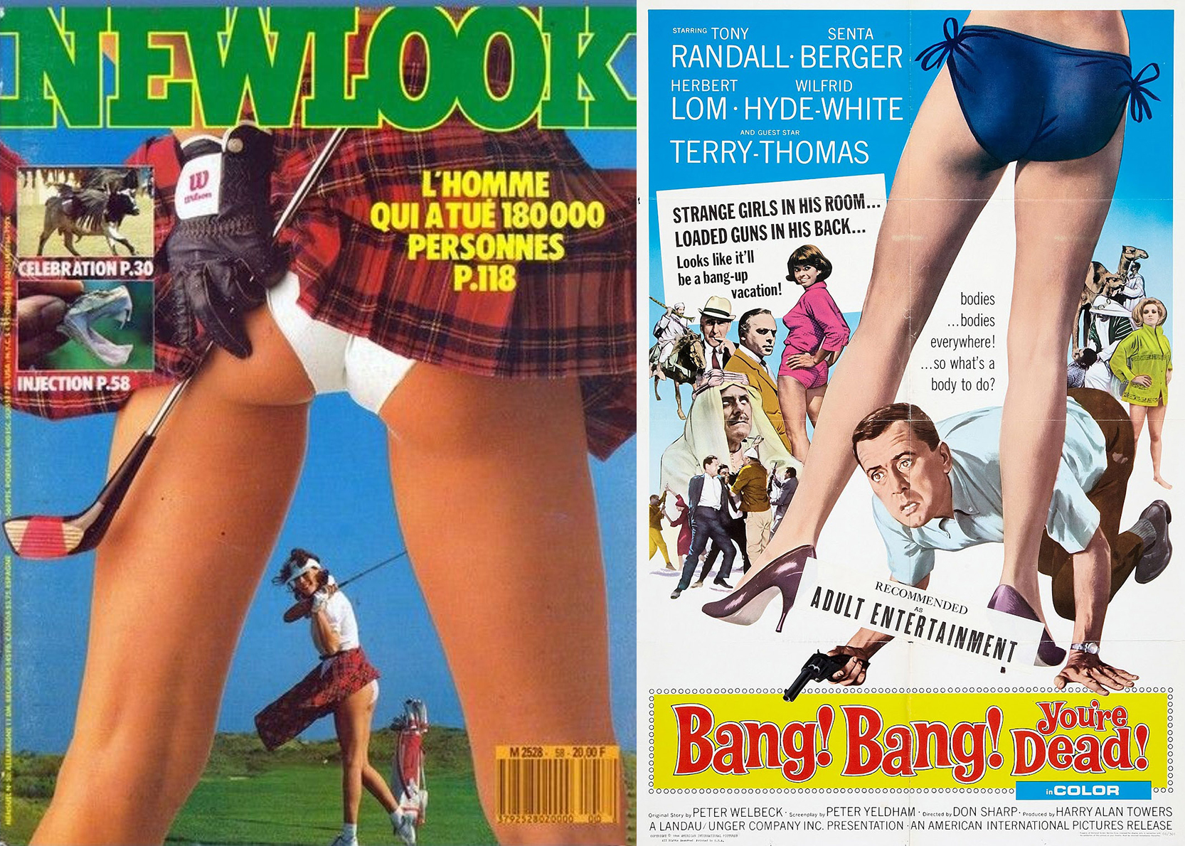
Of course, sometimes it has no meaning at all – it’s just a lazy way to design a layout… and often provides an excuse to show a woman’s backside.

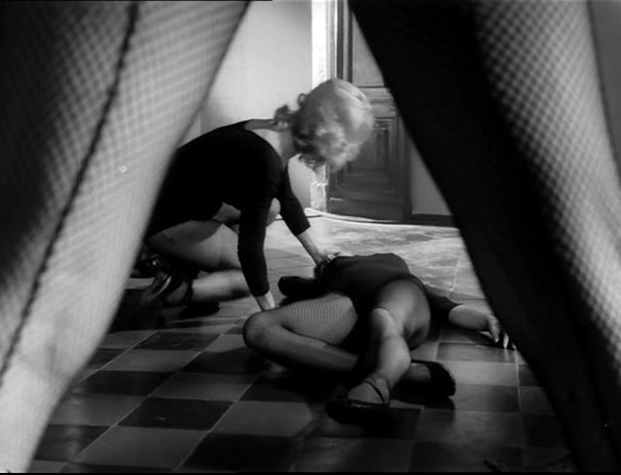
The A-Frame is also a common way to set up a shot in cinema. This example is from The Playgirls and the Vampire (1960)
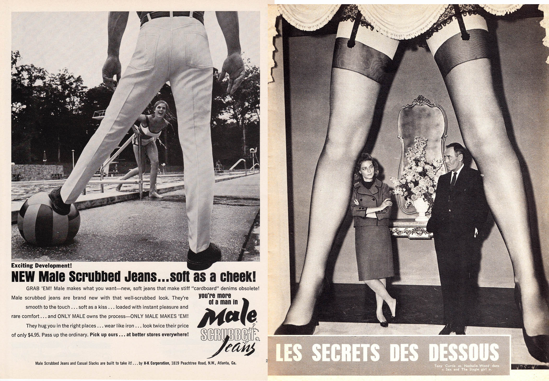

You’ve got to admit – the A-Frame brings an extra bit of excitement to an otherwise run-of-the-mill image. Picture either of these without the A-Frame; there’d still be “action” but it’s just not as engaging. The A-Frame is an easy (albeit highly unoriginal) means to inject your composition with a little mojo.
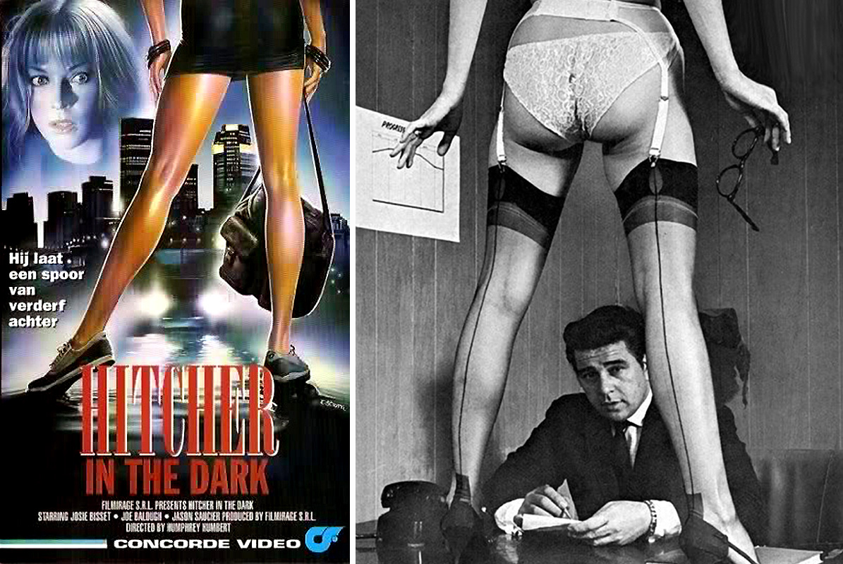
Warning: Once you become aware of the A-Frame, you will begin to see it everywhere. You’ll notice it on old VHS covers, tattered photographs, album covers, advertisements… it’s ubiquitous. Try not to let it consume your life.

If we’re being nit-picky – sometimes an A-Frame isn’t technically an A-Frame. For example, the Fausto Papetti album above features a pair of legs which are cut off mid-thigh… thus technically not forming an “A”. I would argue that it still counts: as long as the subject is framed by the open legs it’s an A-Frame in my book.
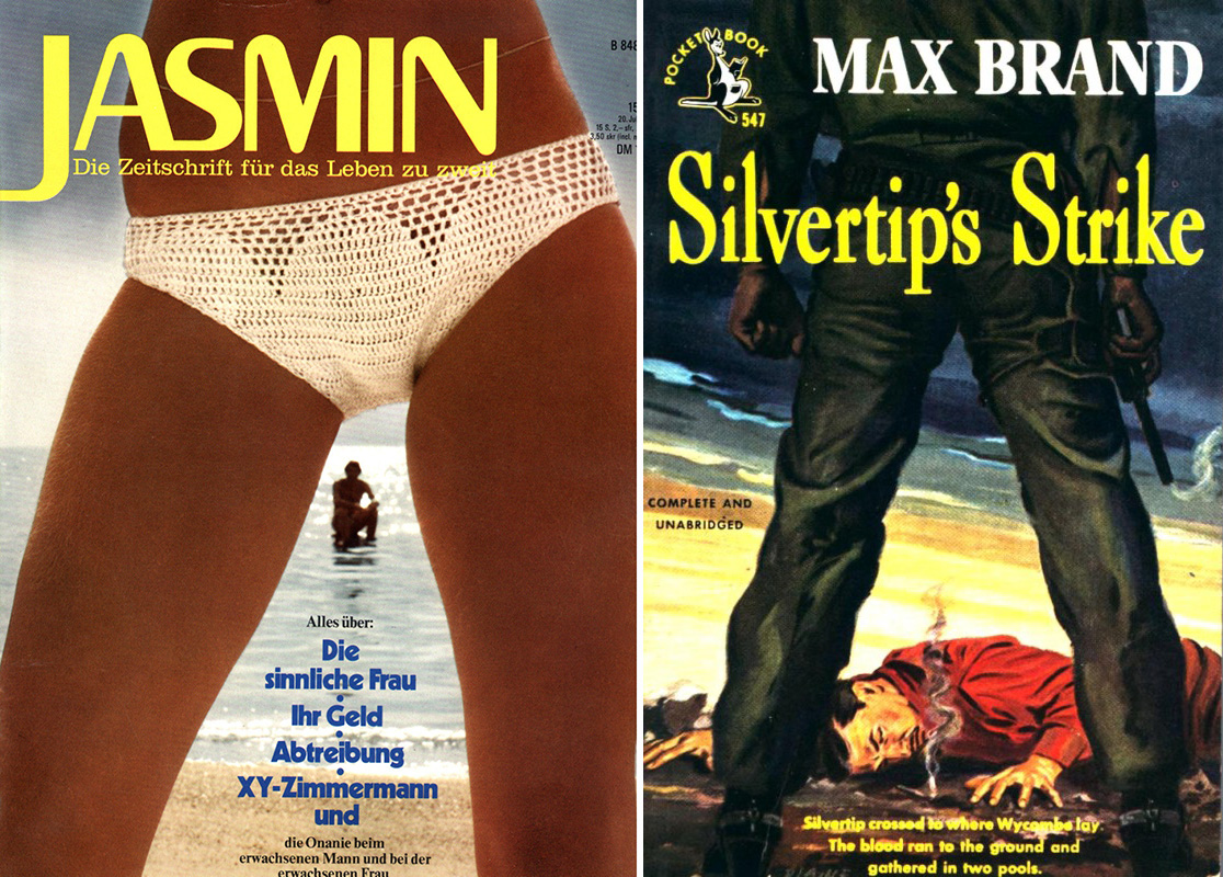
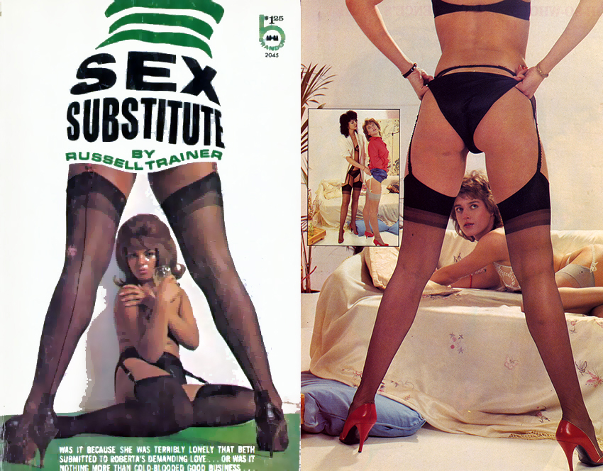
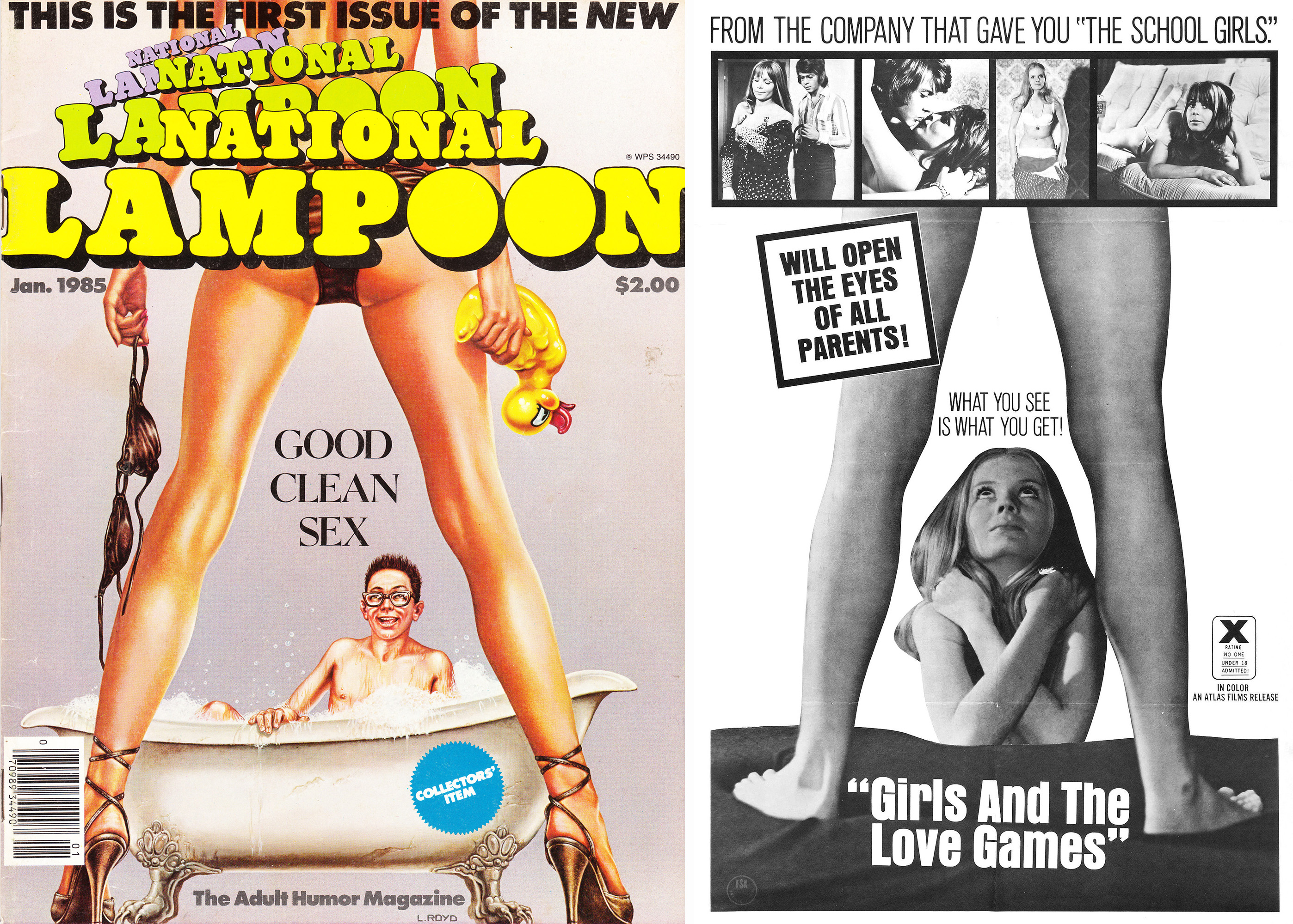

Consider the A-Frame the “retro” version of today’s many photograph filters and effects used on phones. You take an otherwise boring picture (i.e. some schmuck sitting on a tennis court), and “PRESTO” add in the A-Frame and suddenly it’s interesting.
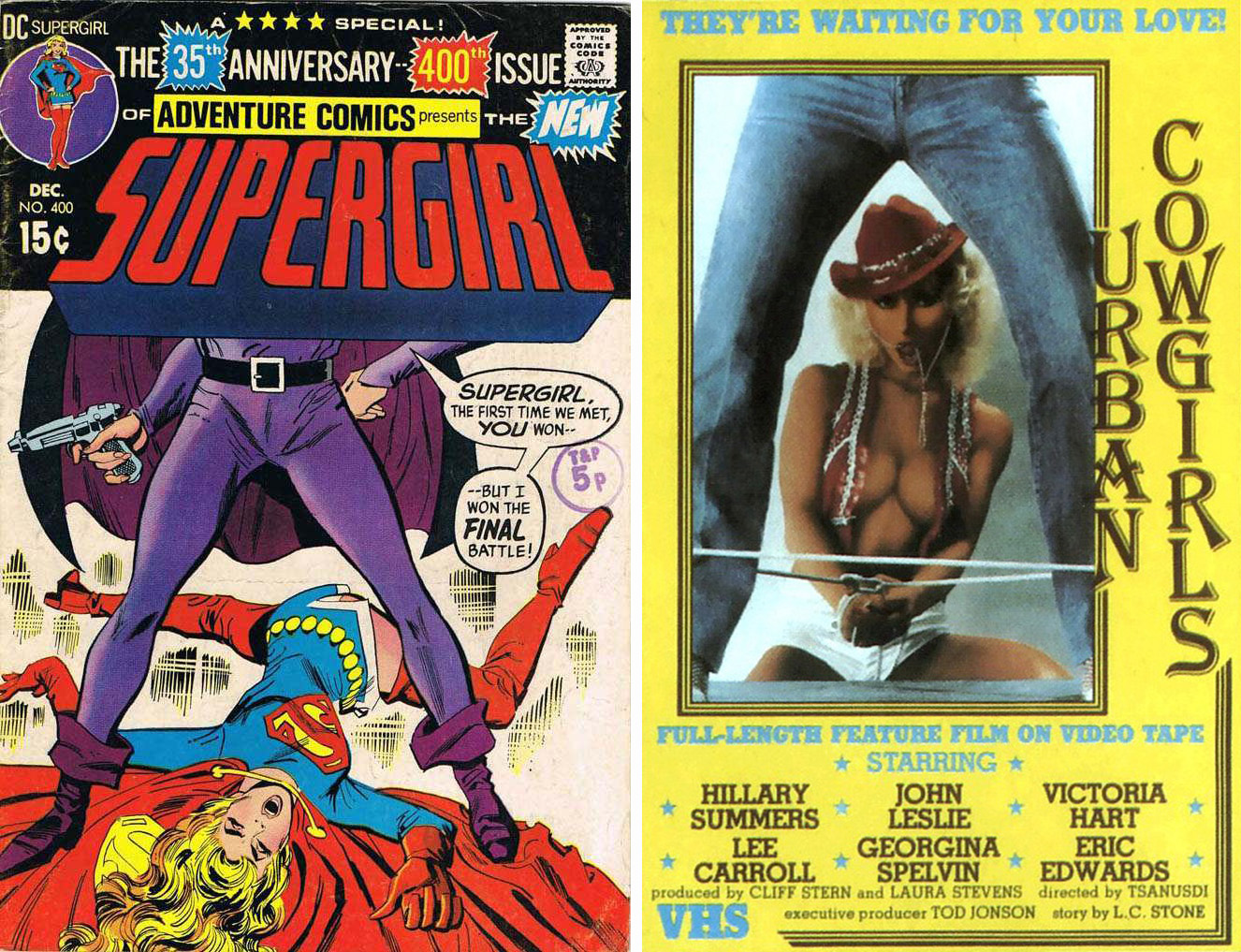
The front-facing A-Frame is far less common than the rear-facing. These are rare treasures indeed.
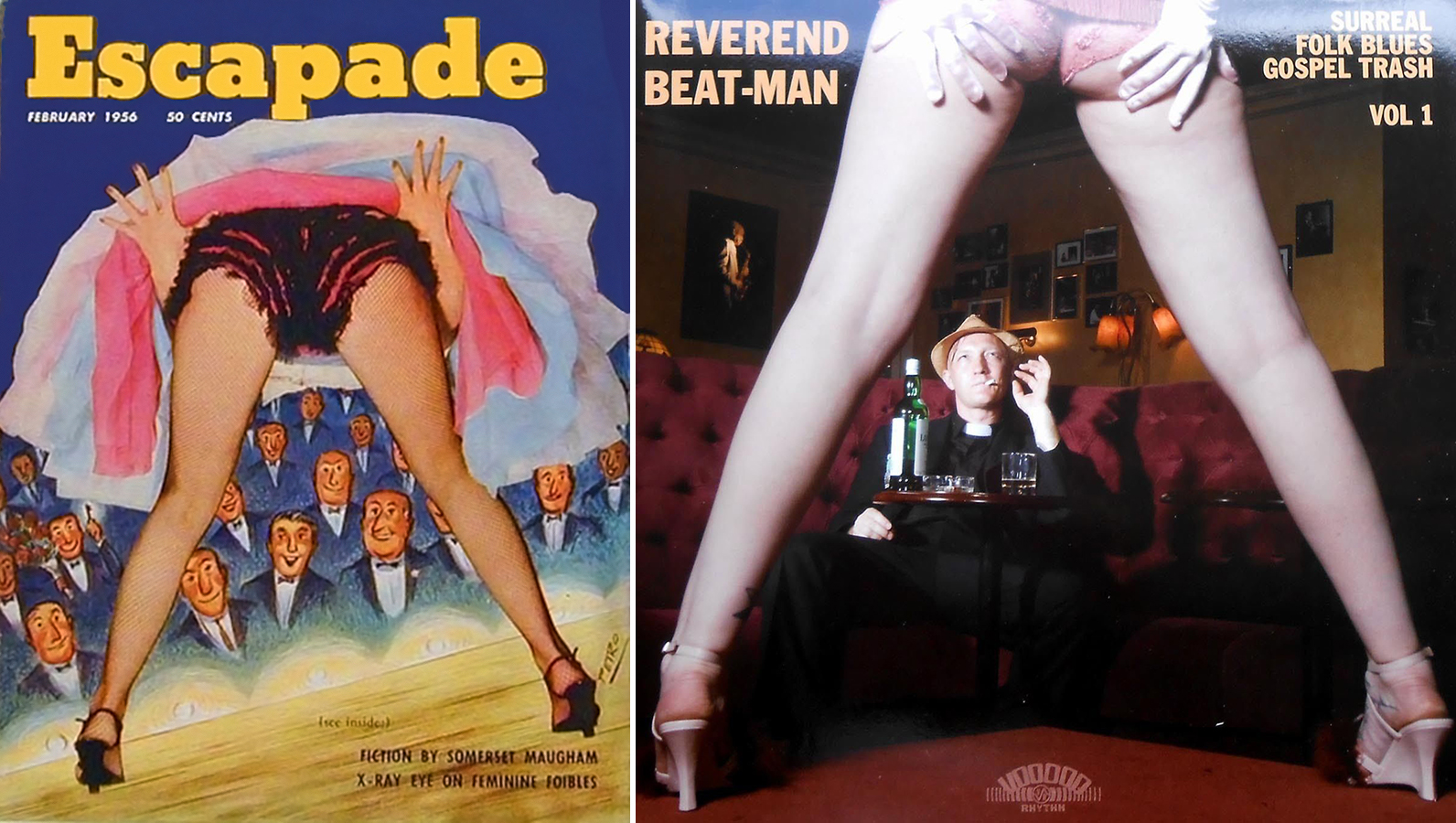
If I had a nickel for every time an A-Frame rears it’s ugly head during a movie or TV scene that takes place in a strip club, I’d be a rich man. The scene below is from the Dan Aykroyd film adaptation of Dragnet.
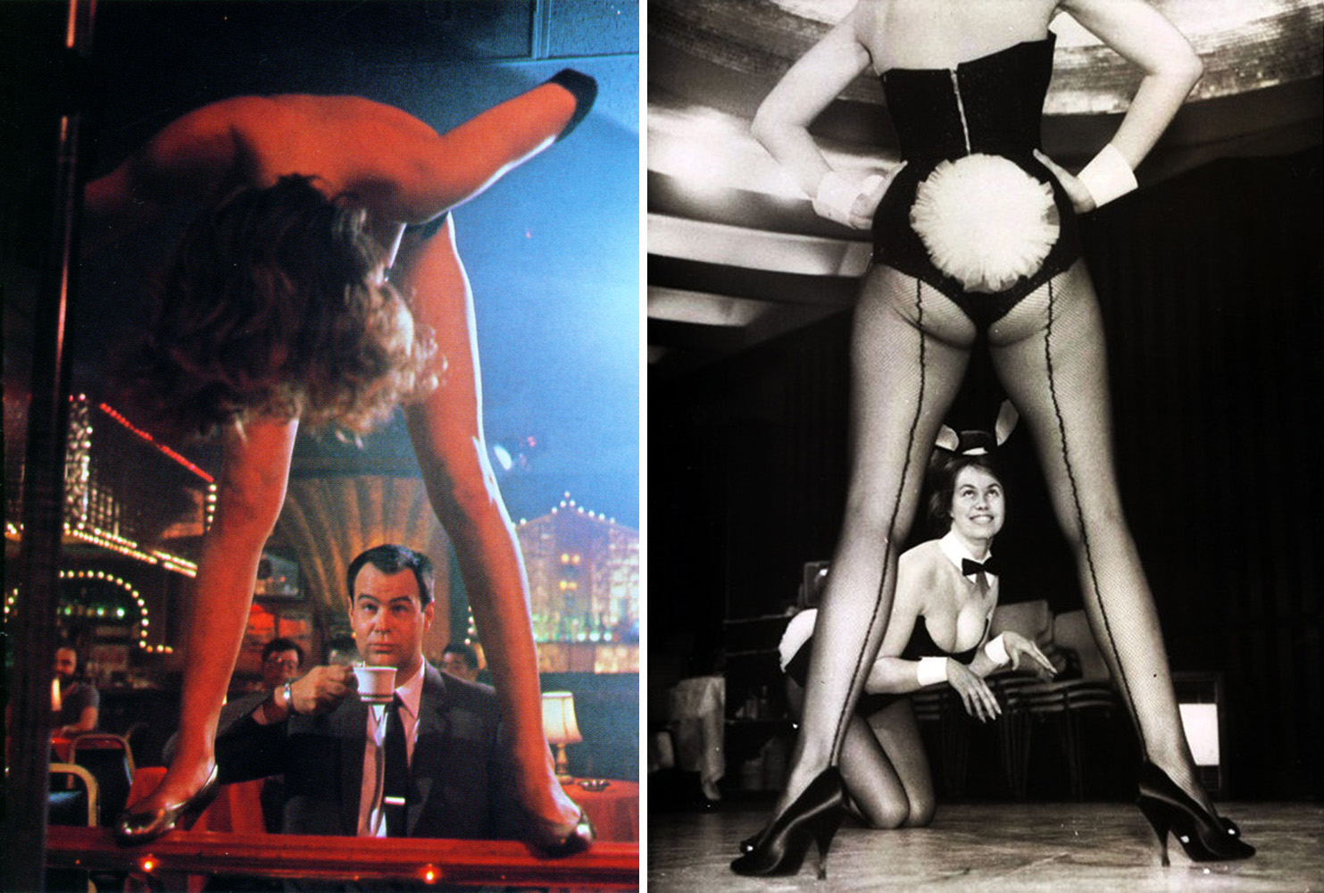
God that was a terrible movie.
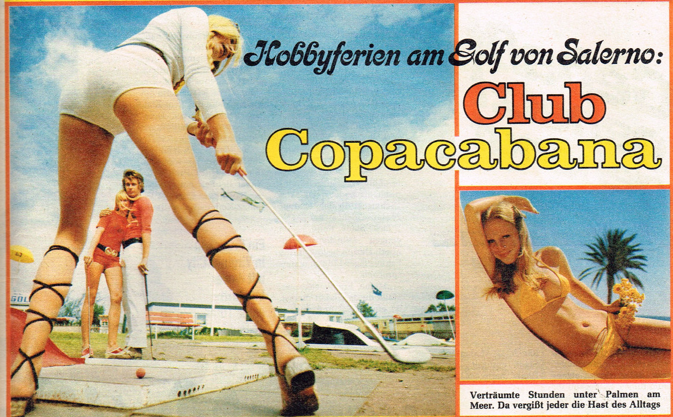
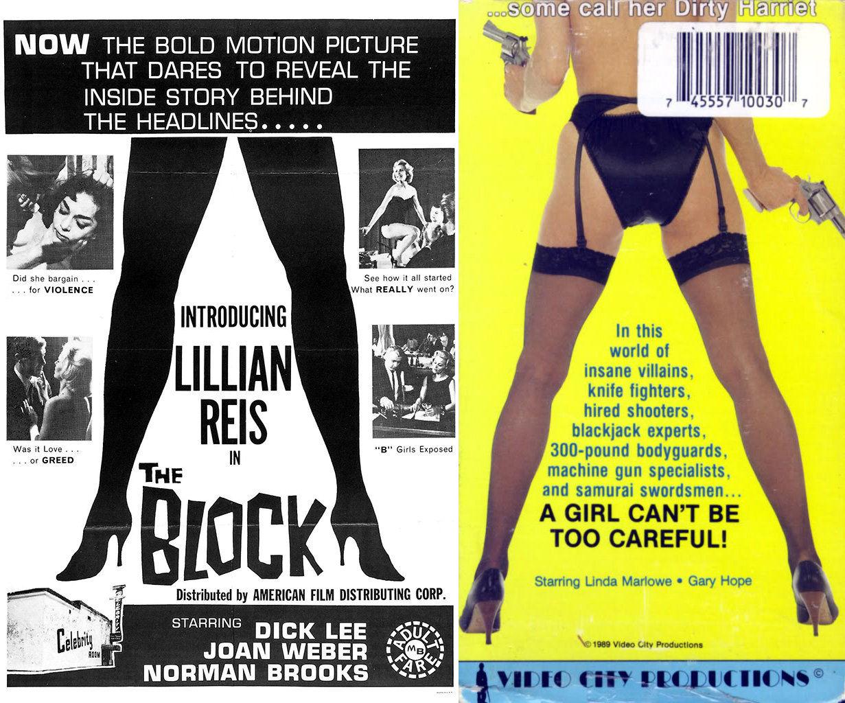
What if an A-Frame is only framing text – is it still an A-Frame? I have on good authority that, yes, it is indeed a legit A-Frame.

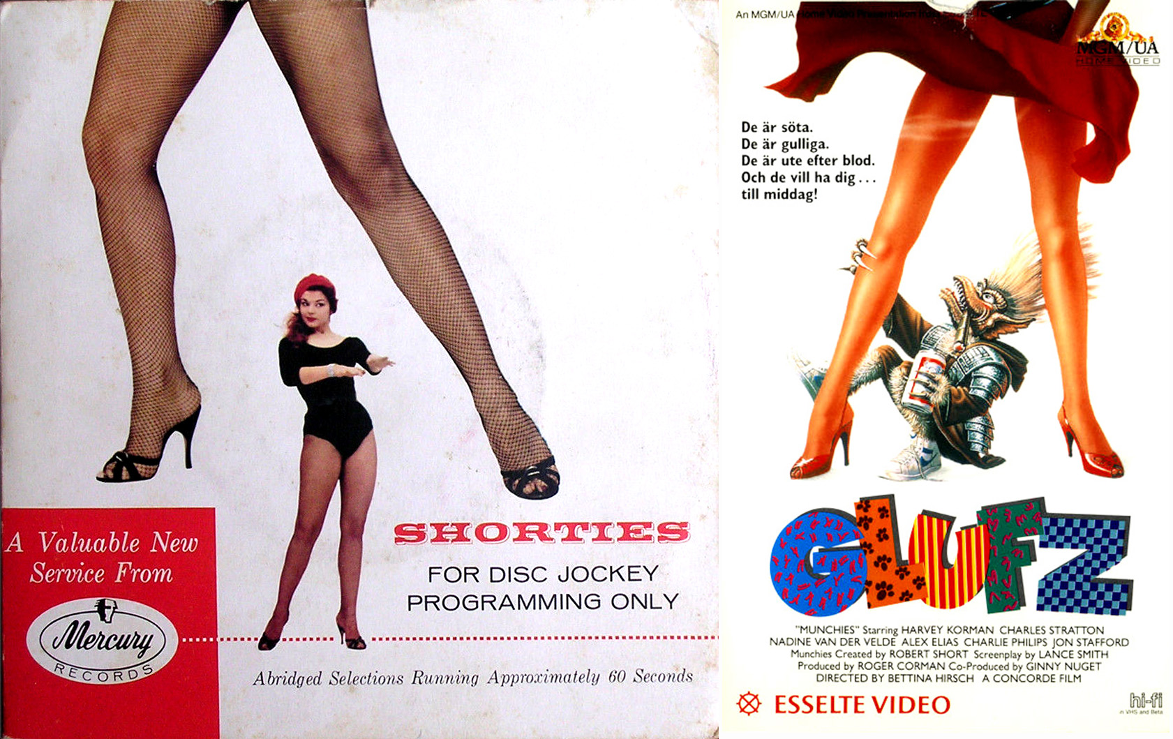
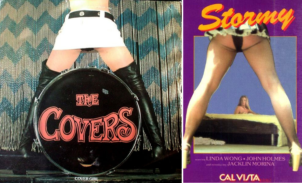
Some day, some sociology graduate student is going to do his/her thesis on the A-Frame. It’ll be titled something like: “Past Paradigms and Gender Norms of the A-Frame Construction”
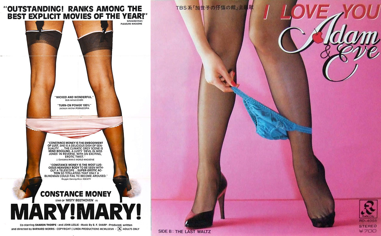
There’s a fine line between a true A-Frame and composition with just a pair of legs. Do they frame the picture though? Let’s not get so wrapped up in technicalities that we can’t appreciate the pattern.
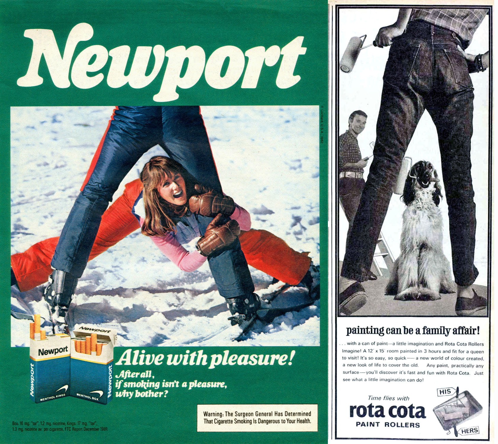
I have a lot to say about the subliminal sexual imagery of Newport cigarette advertising- read the article here: Alive With Pleasure! Insanely Sexual Newport Adverts of the 1970s-80s




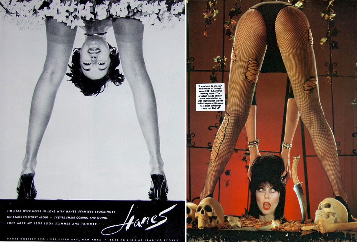
We may be pushing the boundaries of the A-Frame here – does framing yourself count? Discuss among yourselves. Until next time –

Would you like to support Flashbak?
Please consider making a donation to our site. We don't want to rely on ads to bring you the best of visual culture. You can also support us by signing up to our Mailing List. And you can also follow us on Facebook, Instagram and Twitter. For great art and culture delivered to your door, visit our shop.

