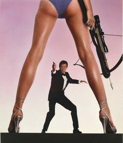
THERE’S only a finite number of ways you can arrange a canvas. Naturally, there’s going to be some patterns that emerge, and certain motifs will be copied and repeated to oblivion within the pop art landscape. An artful conception will suddenly be mimicked on comic book covers to movie posters to paperbacks to album covers, and it will continue for decades.
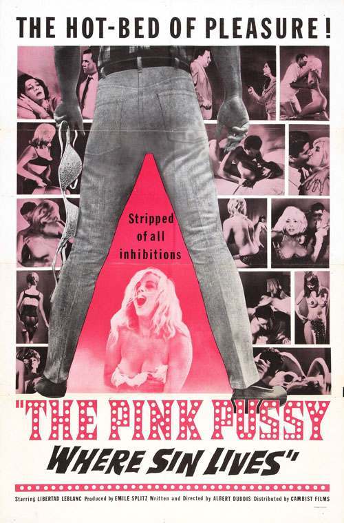
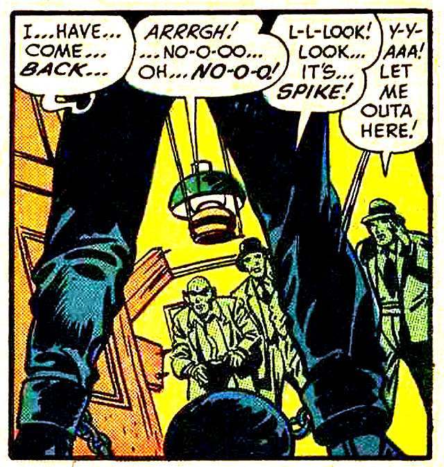
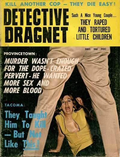
Perhaps the best example of this is the so-called A-Frame – a cutoff-torso-spread-leg framing device that went viral in the 1960s and continued for years afterward. The most well-known example is the For Your Eyes Only movie poster; but this motif is by no means limited to movie art – it has shown up on everything from Green Lantern comics to VHS box art. Here is a generous helping of A-Frames to give you a glimpse into its ubiquity. Make no mistake, this is only the tip of the A-Frame.
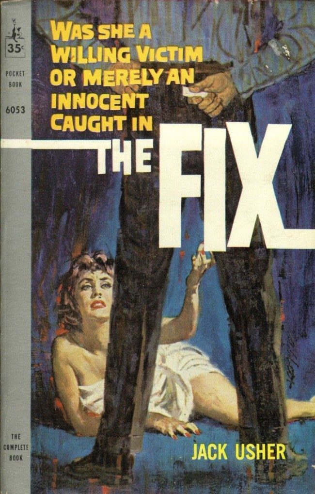
From an armchair sociologist’s perspective, it’s rife with meaning and subliminal interpretations. It almost always represents power of some kind – brute force, in the case of men, and sexual domination in the case of women.
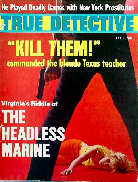
The individual appears larger and above the secondary figures. You’ll notice time and again that when it’s a man in the A-Frame position, the power is from violence – i.e. a showdown between two cowboys, or a violent attacker. When it’s a woman in the A-Frame position, it’s sexual – long slender legs, almost always with heels. James Bond in the For Your Eyes Only movie poster may have the gun; however, there’s no denying the anonymous, faceless woman has all the power…. the sexual power.
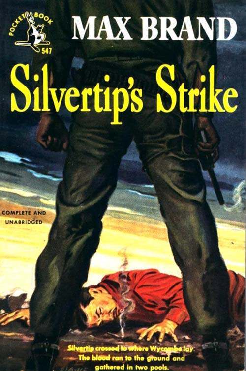
Why always from the back? Why is it always a faceless, mysterious individual, rather than the A-Frame positioned toward the viewer with face visible? Something about this form is subconsciously compelling.
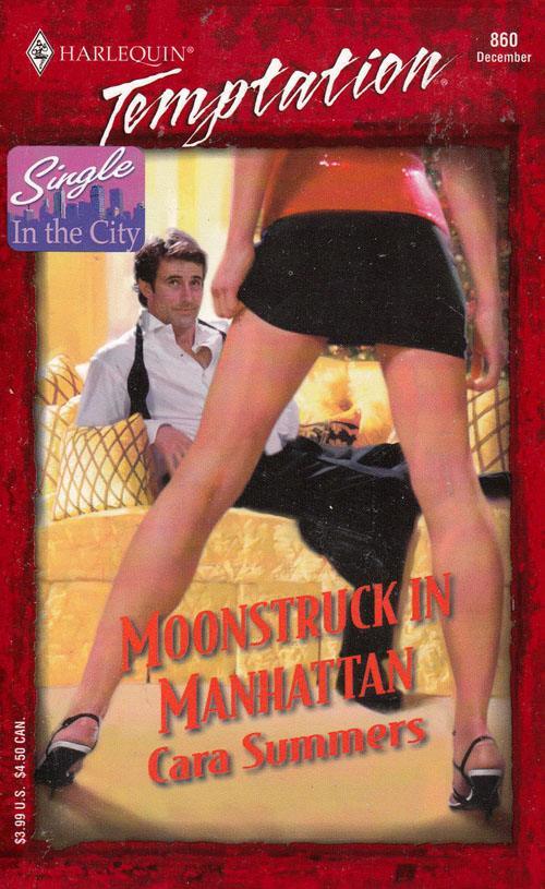
Not surprisingly, the image pops up quite often in trashy paperback covers and B-movie posters. It’s a rather more threatening pose when you think about it – not family friendly.
. 
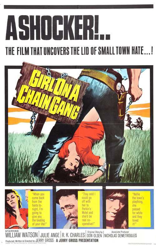
Okay, so we can see what the pose implies (confrontation, domination, sexual power, etc.). But why did it suddenly go viral?
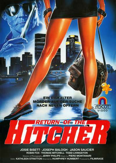
One obvious reason is that it’s easy to create a compelling illustration. A normal run-of-the-mill scene suddenly has a visual impact. Imagine the Return of the Hitcher poster above if they had chosen to show the woman’s entire body from behind. A bit of the magic is lost, don’t you think? It’s not quite as captivating.

Of course, more often than not, it’s just sheer laziness that causes designs to go viral. Take note of how ridiculously Xeroxed these A-frames can be. By the late 1980s-90s, the A-frame had been played. Artists continuing to use it were just phoning it in.


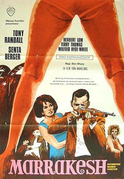
Take note that this film is from the 1960s. It’s amazing to see that poster predates the ones above it by over a decade,yet the A-frame motif is largely unchanged.

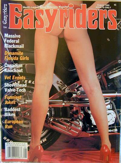
I’d posit that another reason for the A-frame’s viral nature is that it’s provides an opportunity to highlight the female backside and legs. If there’s one thing that sells videos, books, magazines and records, it’s legs ‘n’ booty.

And finally, beyond it being (1) a compelling pose (2) an easy layout to lazily mimic, and (3) an opportunity to display lots of legs and butts, the A-Frame also struck a chord in our collective mindset. As with all art and design, beauty isn’t so much in the eye of the beholder as much as the collective eyes of the masses. For instance, certain fonts looked great in the 1980s, but look hokey today. Polka dots were huge in the 1960s, but fell out of favor in the 1970s. What happened to create these shifts in our collective mindset? I expect a 500 word essay on my desk by Friday.
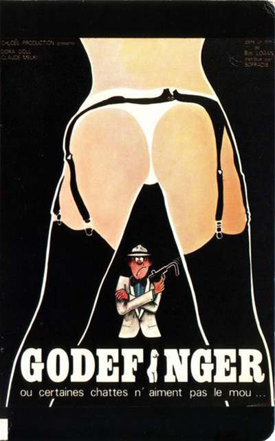
Also take note that the A-frame transcends geography. It appears in Poland as well as Argentina – it knows no boundaries.


It should also be pointed out that A-frame didn’t begin in the 1960s. There’s plenty of examples from earlier days (such as the advert below), but for whatever reason didn’t take hold and go viral until the 60s.

The next question is whether or not the A-frame is dead. It still can certainly be found from time to time; however, the viral nature of it evaporated years ago.
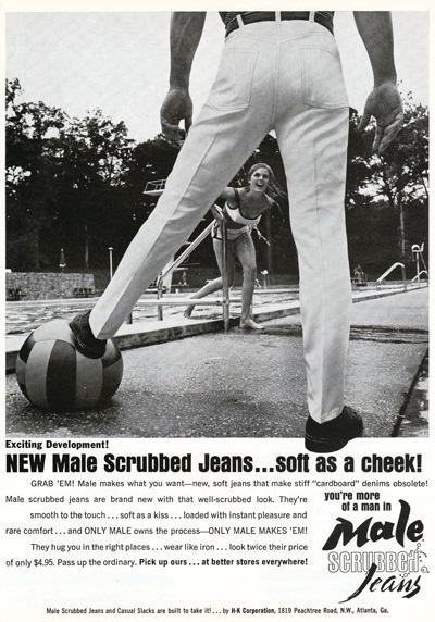
Male Scrubbed Jeans had an entire ad campaign in the 1960s revolving around the A-frame. There were multiple adverts like the one above, each featuring the beloved pose we’ve come to know and love.
Well, we could go on all day. Suffice it to say, the 1960s-80s were wall-to-wall A-frames. Sadly, its Golden Age is long gone. Sure, it shows up on crummy DVD covers on occasion, but its magnificent omnipresence has faded. And while other viral designs have taken its place, nothing will compare to the longevity and ubiquity of the mighty A-frame.
Would you like to support Flashbak?
Please consider making a donation to our site. We don't want to rely on ads to bring you the best of visual culture. You can also support us by signing up to our Mailing List. And you can also follow us on Facebook, Instagram and Twitter. For great art and culture delivered to your door, visit our shop.

